If you’re frustrated with all of the ads popping up while trying to read the news, check out this revelation about how totally out of control the situation has become. This is such a great expose, that I am showing some excerpts below. Link to the article for the entire piece on Shubham Bose’s blog.
https://thatshubham.com/blog/news-audit
The 49MB Web Page
Published March 12th, 2026
If active distraction of readers of your own website was an Olympic Sport, news publications would top the charts every time.
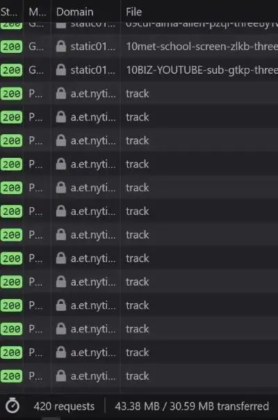
I went to the New York Times to glimpse at four headlines and was greeted with 422 network requests and 49 megabytes of data. It took two minutes before the page settled. And then you wonder why every sane tech person has an adblocker installed on systems of all their loved ones.
It is the same story across top publishers today.
To truly wrap your head around the phenomenon of a 49 MB web page, let’s quickly travel back a few decades. With this page load, you would be leaping ahead of the size of Windows 95 (28 floppy disks). The OS that ran the world fits perfectly inside a single modern page load. In 2006, the iPod reigned supreme and digital music was precious. A standard high-quality MP3 song at 192 kbps bitrate took up around 4 to 5 MB. This singular page represents roughly 10 to 12 full-length songs. I essentially downloaded an entire album’s worth of data just to read a few paragraphs of text. According to the International Telecommunication Union, the global average broadband internet speed back then was about 1.5 Mbps. Your browser would continue loading this monstrosity for several minutes, enough time for you to walk away and make a cup of coffee.
If hardware has improved so much over the last 20 years, has the modern framework/ad-tech stack completely negated that progress with abstraction and poorly architected bloat?
CPU throttles, tracking and privacy nightmares
News websites really really like to track.
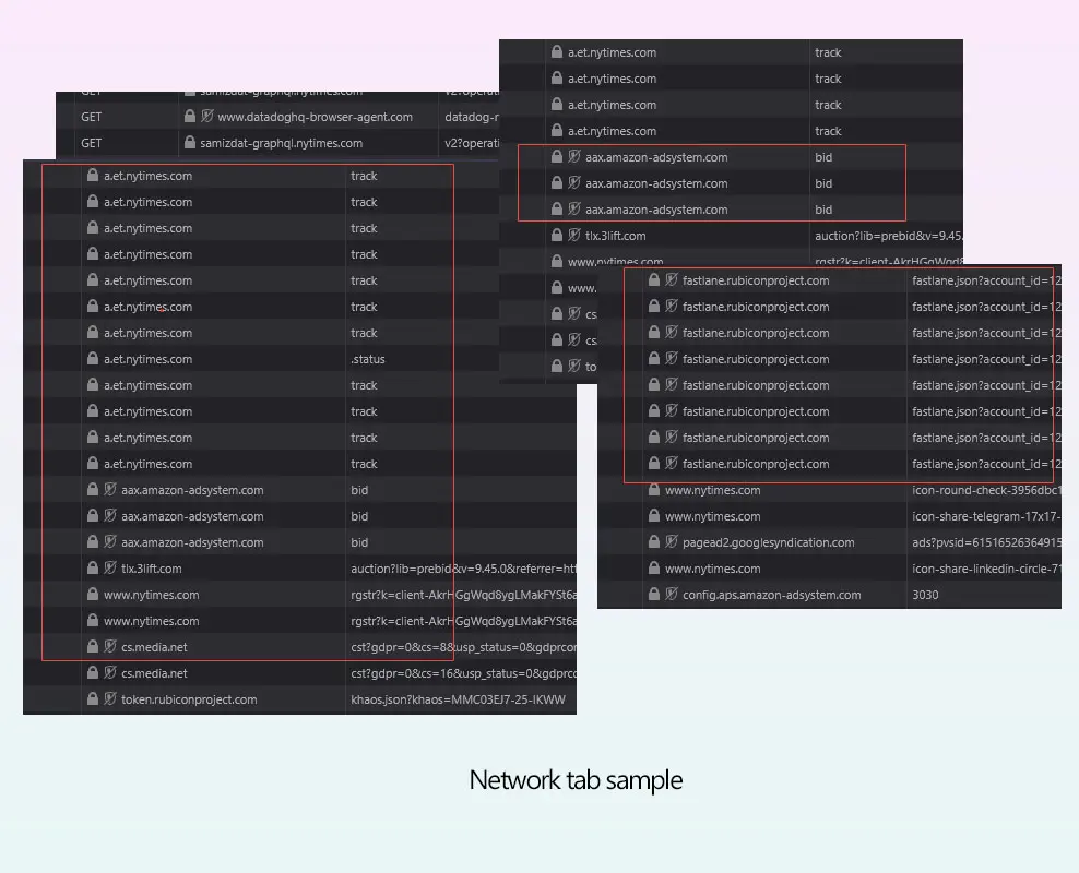
For the example above, taking a cursory look at the network waterfall for a single article load reveals a sprawling, unregulated programmatic ad auction happening entirely in the client’s browser. Before the user finishes reading the headline, the browser is forced to process dozens of concurrent bidding requests to exchanges like Rubicon Project (fastlane.json) and Amazon Ad Systems. While these requests are asynchronous over the network, their payloads are incredibly hostile to the browser’s main thread. To facilitate this, the browser must download, parse and compile megabytes of JS. As a publisher, you shouldn’t run compute cycles to calculate ad yields before rendering the actual journalism.
- The user requests text.
- The browser downloads 5MB of tracking JS.
- A silent auction happens in the background, taxing the mobile CPU.
- The winning bidder injects a carefully selected interstitial ad you didn’t ask for.
Common story across many offendersA relentless heartbeat of surveillance.
Beyond the sheer weight of the programmatic auction, the frequency of behavioral surveillance was surprising. There is user monitoring running in parallel with a relentless barrage of POST beacons firing to first-party tracking endpoints (a.et.nytimes.com/track). The background invisible pixel drops and redirects to doubleclick.net and casalemedia help stitch the user’s cross-site identity together across different ad networks.
When you open a website on your phone, it’s like participating in a high-frequency financial trading market. That heat you feel on the back of your phone? The sudden whirring of fans on your laptop? Contributing to that plus battery usage are a combination of these tiny scripts.
Ironically, this surveillance apparatus initializes alongside requests fetching purr.nytimes.com/tcf which I can only assume is Europe’s IAB transparency and consent framework. They named the consent framework endpoint purr. A cat purring while it rifles through your pockets.
So therein lies the paradox of modern news UX. The mandatory cookie banners you are forced to click are merely legal shields deployed to protect the publisher while they happily mine your data in the background. But that’s enough about NYT.
The Economics of Hostile Architecture
Publishers aren’t evil but they are desperate. Caught in this programmatic ad-tech death spiral, they are trading long-term reader retention for short-term CPM pennies. The modern ad industry is slowly de-coupling the creator from the advertiser. They weaponize the UI because they think they have to.
Viewability and time-on-page are very important metrics these days. Every hostile UX decision originates from this single fact. The longer you’re trapped on the page, the higher the CPM the publisher can charge. Your frustration is the product. No wonder engineers and designers make every UX decision that optimizes for that. And you, the reader, are forced to interact, wait, click, scroll multiple times because of this optimization. Not only is it a step in the wrong direction, it is adversarial by design.
The reader is not respected enough by the software. The publisher is held hostage by incentives from an auction system that not only encourages but also rewards dark patterns.
And almost all modern news websites are guilty of some variation of anti-user patterns. As a reminder, the NNgroup defines interaction cost as the sum of mental and physical efforts a user must exert to reach their goal. In the physical world, hostile architecture refers to a park bench with spikes that prevent people from sleeping. In the digital world, we can call it a system carefully engineered to extract metrics at the expense of human cognitive load. Let’s also cover some popular user-hostile design choices that have gone mainstream.
The Pre-Read Ambush

Selected GDPR examplesThe advantage and disadvantages of these have been discussed in tech circles ever since they launched.
When a user clicks a news link, they have a singular purpose of reading the headline and going through the text. The problem is that upon page load, users are greeted by what I call Z-Index Warfare. The GDPR/Cookie banners occupy the bottom 30%. The user scrolls once and witnesses a “Subscribe to our Newsletter” modal. Meanwhile the browser has started hammering them with allow notification prompts.
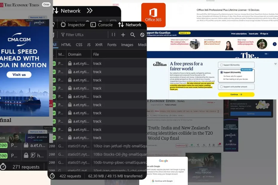
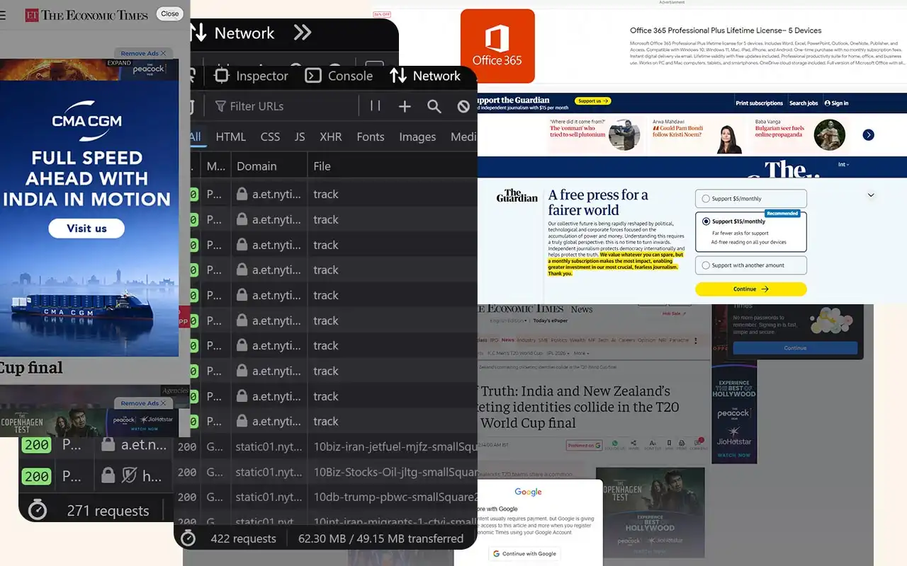
The user must perform visual triage, identify the close icons (which are deliberately given low contrast) and execute side quests just to access the 5KB of text they came for. Let’s look at how all these anti-patterns combine into a single, user-hostile experience. Here is a teardown of a standard page load of Economic Times.
UX TEARDOWN

Economic Times: Imagine deploying this to production. Does anyone even care about how their end-product appears to a user anymore?